I have three variations of my logo which all have the same key elements, which gives me the advantage of always being able to show my brand in any situation, from thumbnails to banner images.
My Website has been optimised for Mobile Phone, Computer and Television, thanks to Dreamweaver. The style is unchanging, black background, neon logo, black and white everything else, with off white text. Where possible, I want to keep the minimalist look to my pages. This makes the focal points, like the logo and showreel the focus of the viewer.
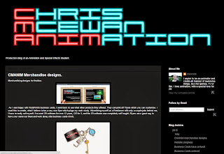
Carrying on the theme, my blog has the same theme, same profile image and logo at the top of the page.
An animation hosting website which I have been a member of for a long time, where you can gain reviews and in some cases, professional work or collaborations to gain exposure. Newgrounds has been essential for my gaining feedback from both animators and casual viewers over the years.
My logo is the CMA thumbnail variant, as there is no banner on the Newgrounds profiles. On my profile, I link to my website and Youtube. Every upload will have the CMA logo beside them, under Author.
The splash card before my animations always have the same set up. Top left is the logo, under that what the piece is, under that, information.
Youtube, as seen by a returning subscriber or new visitor.


No comments:
Post a Comment