Saturday 23 May 2015

DVD Cover

Using a DVD template, I created this layout. It features my Logo prominently on the front with what I do, 2D/CG character animation, plus my contact details. On the rear, it reiterates my contact details, plus what programs I can use to a good standard. Decorating the design are screen shots of work that is featured in my showreel. I chose the most eye catching screens which I have revieved most praise for from all that is featured in the showreel.
I had to be aware of bleed areas and fold areas which can distort the images. These are especially on the spine.

Advanced Animation and VFX Week 14-2

I'm preparing for my hand in tomorrow, so I will review my Animation piece with what feedback I gathered online. Also, I will showcase my Showreel.

My showreel features music from Norwegian band Flare, a band I became friends with a couple years ago. I'm actually featured in their second album under the Thanks section! They're a band I got to know while working as a volunteer on my hometown's radio station, where I was a regular broadcaster which featured bands from across the world who weren't household names and who I had become friends with through Myspace (yes, it was that long ago)

I am friends with the band members on Facebook, where I messaged the band's singer, who wrote the song. Truls Marius Dale (Tiam Dee).
When I had asked one of my lecturers how I could show I had got permission to use a track from a band, he had told me so long as it was in writing, it was fine! Flare are an excellent group of musicians from Bergen, Norway. Thanks to Truls Marius Dale, I was able to have an upbeat, happy rock/pop track to my animation. I was able to have some of the animation hit beats well which really emphasises the animation, I feel, as do those who have seen my reel. Former animation student Alex Wright was not only impressed with how the music complimented my animation style, but also the quality of the animation shown and the range of skills I have shown.

Reviews of the Wrestling piece were very positive! I mainly got feedback from the website Newgrounds.

Newgrounds gives a visual rating on the page out of 5 stars. The piece has been up since Monday 18th May and has scored 3.68/5

Animator Rob Yulfo (Freelance animator who has been featured on Comedy Central's Trip Tank) said of the piece that it reminds him of Rockem Sockem Robots, which is something I've heard a couple times since selecting those models. Of the animation, he told me that it is of very good quality. As someone who has worked with Maya in the past, he knows how tempting it is to have the camera floating through the scene, which is something I actively set out to avoid since the beginning. My choices of camera angles played the piece well, showing the Face Character being on the back foot until he manages to reverse the Curb Stomp, where the camera is a low angle for the Heel character, emphasising the danger for him.

Simon Jobson, who has experience with animation for web design, commented on the fluidity of the secondary movement and the emphasis before moves are performed. He also followed up with a quote of South Park, "That's not real Wrastling!"

Newgrounds user Mighty Dein complimented the careful attention to the poses within the piece which created an excellent animation for character interaction.

Another user Maddude13pt2 wished I had actually made a full 3 minute short of the fight, suggesting that in the future, maybe think of doing a collaboration with other animators to lighten the load of animating it all.

The reviews were ranged between 3-5 stars, with the overall rating being based off of the views where the users rated (not reviewed).

Branding Myself Online

So as to have brand awareness, it's important to keep to a tight image style.
I have three variations of my logo which all have the same key elements, which gives me the advantage of always being able to show my brand in any situation, from thumbnails to banner images.
My Website has been optimised for Mobile Phone, Computer and Television, thanks to Dreamweaver. The style is unchanging, black background, neon logo, black and white everything else, with off white text. Where possible, I want to keep the minimalist look to my pages. This makes the focal points, like the logo and showreel the focus of the viewer.
 Carrying on the theme, my blog has the same theme, same profile image and logo at the top of the page.
 An animation hosting website which I have been a member of for a long time, where you can gain reviews and in some cases, professional work or collaborations to gain exposure. Newgrounds has been essential for my gaining feedback from both animators and casual viewers over the years.
My logo is the CMA thumbnail variant, as there is no banner on the Newgrounds profiles. On my profile, I link to my website and Youtube. Every upload will have the CMA logo beside them, under Author.
 The splash card before my animations always have the same set up. Top left is the logo, under that what the piece is, under that, information.

Youtube, as seen by a returning subscriber or new visitor. 

CMANIM Merchandise designs.

Merchandising designs for freebies
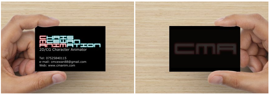
 As I was happy with VistaPrint's business cards, I went back to see what other products they offered. They can print off Flyers which you can customise. I used this to create, what I believe to be a very nice flyer which plugs my work nicely. Advertising myself as a Freelancer with only a couple jobs behind me, I have to really sell myself. I've used 2D software for over 12 years, CG for 3, and the 2D software was completely self taught. Flyers are a great way to have your name out there and work along side business cards nicely.

I designed these keyrings and a bottle opener using my own keys as a base. The CMA is a simple keyring. The original was a Flamingo Land Keyring with a photo of me, my brother and my nephews. I like the keyring, it's a good size and grabs attention. I added a plastic cover effect using Photoshop to make it blend better. The CMANIM keyring is a rubber keyring, so it's not as prominent in the pocket, but with the light blue, it's eye catching. It uses Red, Blue, Black and White, which are part of my colour scheme for the website and main logo.

 VistaPrint can make magnets for you, so I took advantage of this. A simple design, just my logo and what I do. If you put this on your fridge and you had an idea for an ecard and went to get a pint of milk for your tea and saw that staring at you, my name would be right there.

8GB Memory Stick featuring the CMANIM variant of my logo, since the area of the stick requires a smaller logo. Everybody needs a memory stick! Even if you use a cloud service, multiple copies are good. I even use my memory sticks for digital copies of films, music or even my animations so I can see how they look on the TV, as most TVs have USB ports.

Wanting to write down some ideas for an animated short or a banner design for your website, but not sure how you'll make it? Why not do it with my branded pen? Who could make it, though? Well, the pen has the answer! 
The same design as what was used on the magnet, but this time a Mouse pad. 

Animation is a stressful process sometimes. Just look at the problems I had in my Production Project. I regularly make use of a stress ball that I have, though now it's discoloured from a lot of use and full of bite and claw marks from my cat who finds it to be a fantastic chew toy. So it's dual use, I guess!
I  added "Let's Beat That Stress!" to the image just to put the point across that by using CMANIM the stress levels can be reduced! Mainly because it'll be me dealing with it all! 

If computer games and films have taught me anything, it's that a lighter is a very handy item to have at all times. Even if you aren't a smoker, you never know when you will need to light a fire in a fireplace to reveal a crystal for a puzzle, to discover the fifth element, light a candle or start the oven because the clicker is broken. Also, I just like the look of Zippo style flip lighters. 

As a lover of tea, I often sit at my computer drinking the stuff and would really love a cup with my own logo on it. Although they aren't particularly imaginative, they are items used on a daily basis and have an actual purpose for more than just advertising. Plus, I think it looks pretty good!

The balloons I did a bit of a joke because of the scene in Ghostbusters 2 with the Hot Beverage Thermal Mug and Free Balloons for the kids. I want to add some fun into my advertising because animation should be fun and I really enjoy making comedy pieces. Animation should have elements that can't be done in real life. That's what sets it apart from film! Limbs "breaking" when walking (like Milt Kahl's walk cycles) add a lot of humour into characters, which is something I strive to emulate.


 The Beanie requires CMANIM rather than the full logo because the blue A in animation does not show. This must just be a stitching issue on VistaPrint's end. The CMANIM shows fine, however.
A basic design for a basic item. VistaPrint give a couple different options for colouring this type of shirt, but Blue and Black isn't an option, so I went with Red and Black, as this is still part of the colour scheme of the website.

Monday 18 May 2015

Advanced Animation and VFX Week 14-1

FINAL PIECE

Breakdown 01
Breakdown 02

I broke the breakdown into 2 parts as they look at solo animation and interaction animation in their own sections.

Sunday 17 May 2015

Advanced Animation and VFX 13-2

Animation and Breakdowns are completed! I'm going to be uploading them tomorrow for feedback and what not from the general public rather than lecturers and peers.
The animation Breakdowns that I looked at to see how they are arranged:
https://youtu.be/2z_k2z5m6H0 - Bobby Pontillas, Frozen
https://youtu.be/l9uaH6bXI4k - Patrick Giusiano, Epic
https://youtu.be/l-S7wQx_hvs - Jamaal Bradley, Tangled
https://youtu.be/szJ9Ohi2FNo - Daniel Peixe, Frozen (Sven)
I found these breakdowns to be the best examples of how to lay out my breakdowns, from 2D planning to the final render.


Friday 15 May 2015

Advanced Animation and VFX Week 13-1

I've been working on my Reel this week, looking at what pieces I would like to use in it, finding music I would like to have over it, things like that.

Website progress

I've been working on a website which will show when you enter www.cmanim.com instead of redirecting to this blog. Hopefully I can have it hosted today. It's a minimalist look, but I really like it. It links to here, Newgrounds, Youtube, Twitter and my LinkedIn, plus gives my contact details on each page.

Business Cards have arrived!

Video Review of business cards

Sunday 10 May 2015

Advanced Animation and VFX Week 12-2

I set the textures and renderer for Linear Workflow and got After Effects ready for Linear, too. When rendering an image using the .exr file format, you must change your framebuffer type to 32-bit float or 16-bit half float. Otherwise, your image will be clamped to [0, 1]. I had my renders at 32 bit Float. 
I've mostly been recovering from the Showcase! My legs still hurt...

The hand in has actually changed from where it says on this Gannt chart. I also fixed the Face character's hand at the end of the piece.

Friday 8 May 2015

Business Cards ordered

Using my updated logos I've created and ordered my cards on Glossy card stock. It's ended up costing about £25, but I should have them by next week. Once I get them, I'll give them a review and show the finish. From what I gather about Vistaprint's Glossy stock, it's only the front face that is glossy. The back face is matte. This is fine with me, as the front face has the bright colours that would be required to pop. The subtle CMA colouring would look good glossy, but matte would be sufficient for that side.

New Logo

I've redone my logo. It's essentially the same as before, but at a higher resolution and a better inner glow. This time, it has the white glow focussed on the centre of the letters. This gives it a more Neon Tube Light, where the hottest light (white) is central, with the splash of colour beyond that, then the outer glow as a slightly darker shade of the letter's main colour. This just helps keep the letters clear.

I've also cut it down to CMANIM and CMA. CMANIM tends to be what I use in project. Cartoon by CMANIM, a CMANIM Production. CMA is my Thumbnail image and what will be on the rear of my business cards.

Original version

Block Colour

Outer blur

Final full title

CMANIM Title splash.

CMA thumbnail image.


The colours chosen are eye catching and actually the inverse of each other.

Inverted image.

I like the inverted image. It reminds me of Tron's logo, which is a big inspiration to my neon themed logo. The black glow on the centre of the letters gives the text an outline look with a glow from the lettering leaking into the middle. I feel, though, that the blue text isn't as eye catching as the red.


Thursday 7 May 2015

Business Card mock up


Vistaprint can create business cards with different card stock. I mocked up a card here which would cost me £9.99

I have not bought this, as I want to have a better quality version on my logo (also need to do one for this blog. I don't like that it is looking a bit blurry)
Instead of having a blank back for the business card, I could spend another £5 to have a full colour backing. Taking the CMANIM from my logo and using that on the back gives the card a bit more interest.

When showing to my lecturer, he suggested using a 20% opacity. This helps differentiate the front and back better.

Taking the CMA, which I have used for Thumbnail images on things like Facebook and on Newgrounds, but with my cleaner image. 

Having this in the center works better when just using the initials. I will be using this set up once I create the higher res version of the logo. 
I'll be ordering these with Glossy Card stock to make them look more professional than just standard card stock which I think looks cheap and not as professional. The finish on the card helps cement in your image to the potential customer.
This would have the price being £14.98 + £3.99 for standard post. £19 for 100 good looking business cards is fine for me. Looking online I have seen examples of Vistaprint Glossy cards and people are very happy with them, and they look good. The back of the cards seem to be matte, with the gloss only on the front, which makes the colours pop. As the back of my cards would be subdued, this is not a problem. The main colour is on the front.

Wednesday 6 May 2015

Advanced Animation and VFX Week 12-1

I was part of the End of year Showcase  yesterday! So some of Sunday and all of Monday was spent getting my video ready for that! It was a great opportunity to get my work reviewed for both Production Project and this piece as I had a section of mostly finished work in my video. It wasn't set for Linear Workflow, though.

Sunday 3 May 2015

Advanced Animation and VFX Week 11-2

Working with a Linear Workflow? I will be! I had got some feedback from an animator friend of mine asking if I had been working with a Linear Workflow for my Production Project and he told me to look it up for future projects, so I've been looking that up.
https://youtu.be/pf5kDcehYXA This video explains it quite well, I found. It even helps you set up the Maya scene for Linear Workflow!

Working towards the last stretch! All I have to do now is a tiny bit clean up and get the scene ready for Linear Workflow! From there, it's the breakdown!