Reference material that I used for my animation concepts
Wednesday, 19 December 2012
Monday, 17 December 2012
FINAL PRESENTATION - ANIMATION
To make this, I used different clips and edited them together to show more principals of animation, like easing in and out, squashing and stretching some secondary action and Pose To Pose (the magazine falling), arcs and anticipation.
I used the Spider based tank in this animation, using the preset motions for the spider CATrig and editing them to move more mechanically (plus adding the compartment the pilot/driver would sit). Using paths for the movement, and the close up section of the human entering the tank being Pose To Pose.
FINAL PRESENTATION - Assets
This is the original set of designs and workings for the logos of Van Laaq, both the official, corporation logo, and the Agent/operative logo.What started as a military style symbol became a 50's American Letterman jacket style symbol, but this would not fit right, so it was back to the drawing board. I liked the idea of the logo spelling out part of it's name, and I settled on "VAN". The tough part was making the letters fit together and make it look natural. I opted for the DNA strand logo, as it was in keeping with the Science tone of the corporation. I considered some of the earlier logos for the Agent logo, testing some as patch designs for uniforms. I looked at several uniform logos and the EMS medical logo struck me right away. The use of snakes would be a good patch. Taking the medical symbol and using it for an agent group who deal in extermination of "assets" seemed quite a nice piece of irony. I quickly found I could make the snakes twist like the DNA strand. But I didn't like it. After a bit of looking, I felt it made no real sense as to why the team would be using that, rather than the main logo, so I set about making a new design. The interlinked snakes came up. I tried different positions but I didn't like that it had no real way of saying who they were for, then it caught my eye. The snakes made a crude V and A, with the space between forming the N. I knew then that I had it.
A DNA strand image and a bit of information about it.
I changed the design slightly for this version, making the N into a mutated strand, as if to suggest that the company's science research is altering mankind, making them better. I changed the colours of the proteins to suggest a mutation, also.
The Snakes emblem for the VAN LAAQ enforcers, plus an example of it used as a patch on a sleeve.
The Lasgun is a basic weapon for Chigusa Kamome agents. The top two images were initial design ideas that I had, but as I'm not a weapon smith, I looked into the M16 and M4A1, two of the most commonly used assault rifles used today. I labelled the image to note the key points which I think would be used on the Lasgun. For the Lasgun, I kept the basic shape of the M16, plus the adjustable Car stock and shroud. Removing the Magazine and installing a Horizontal feeding mechanism for the Laser Power Pack, making it a secondary Foregrip. The cocking mechanism became a valve piece for the vents, in the event of overheating from prolonged firing. Adding a Picatinny rail to the bottom of the shroud allows for attachments to be placed on it. Plus, with a rail on the top of the body, I added a Red Dot Sight (RDS).
A Perspective view of how I think the Lasgun would look, plus some information about Bio enhancements within agents and varieties of weapons available through them.
An example of the Sword arm, with muscle showing to give an example of how it joins to the host, also allowing swapping weapons depending on the mission they embark on.
For this piece, I looked at using the Lasgun as an arm mounted weapon. The initial design (top) was taken directly from the original weapon drawing, but shortened to accommodate being used under a membrane skin. I added some history to the updated weapon as if it was a weapon report by Chigusa Kamome, stating improvements in technology through acquiring companies.
The original design of a wrist mounted keyboard that would be used for a stealth mission (rather than taking a weapon arm, they could use this to hack systems). It shows the fingers being used as cables, plus a little information about the mod idea.
A more detailed version, featuring a flipdown keyboard and a screen used to access systems. I took this idea from using my Nintendo DS as a prop to get the opening motions.
FINAL PRESENTATION - Environment
The first totally digital environmental design showed the front of a compound.
Being my first real attempt at Photoshop, this was mainly to get used to the brushes and layout of the program.
From here, I developed the following;
Another Compound front gate, but this time showing a cityscape in the background. I wanted to add this to show that the compound was a central location in the city, that it is a headquaters for Van Laaq Sciences.
Further implementation had me designing a Comms Array, which would be used to keep in contact with support troops and agents in the field. The idea of the Comms Array in the film would be Chigusa Kamome attempting to destroy these to prevent reinforcements arriving.
I thought the background looked quite bare, so I added more Compound structures to it, another watchtower and some labs/buildings to populate the horizon.
An early design of the new Tyne Bridge coloured using Copic markers and fineliners (For the light array)
This is the hand drawn section of a cityscape environment. It is based off of 74 Broadway and Pine in New York, New York. I will be adding this to Photoshop to digitally colour it.
At some points I used "Paper terrain" for Tabletop games (one I play called Necromunda, from Games Workshop)
Used are two models from House Orlock (Necromunda gang) and two kits from www.Worldworksgames.com (terrain website) called Outpost 105 and Abbandonned (the brown building in the back)
Thursday, 6 December 2012
Biped Vs Cat Rig
It's getting close to final piece hand in time now, so the heat is on to get this done!
For my final video sections, I did tests to see what model I would use, CAT or Biped?
Here are two tests!
For my final video sections, I did tests to see what model I would use, CAT or Biped?
Here are two tests!
This is the Biped test. It is unfinished as I realized two things. One, the animation was running at 30FPS and the images used were exported at 24FPS. Animating with the Biped rigs are a bit tricky in some respects, features on them are smaller, like the hands (Where as the CAT rigs have larger squares), which made some of the animation tweak out and flip around slightly.
The CAT rig test for reloading. This is just a quick bash at using the CAT rig. For the final animations, it shall be smoother and feature secondary actions and what not. The image you see in the background was made using Tabletop terrain I use for Necromunda (Games Workshop). If you would like it, www.worldworksgames.com allows you to buy the .pdf and you mount it yourself. This particular one is Outpost 105, with Abandonned Building in the back, on the left.
Like above, I used images rendered from a video at 24FPS, but had 3Ds running at 24, also. Like I said, things will be altered in the final piece, secondary animation, and possibly a prop of a weapon and magazine (as this clip shows reloading).
From these tests, I found that CAT rigs are easier to work with, and I shall be using these for my final piece.
Wednesday, 28 November 2012
Sunday, 25 November 2012
Concept environment
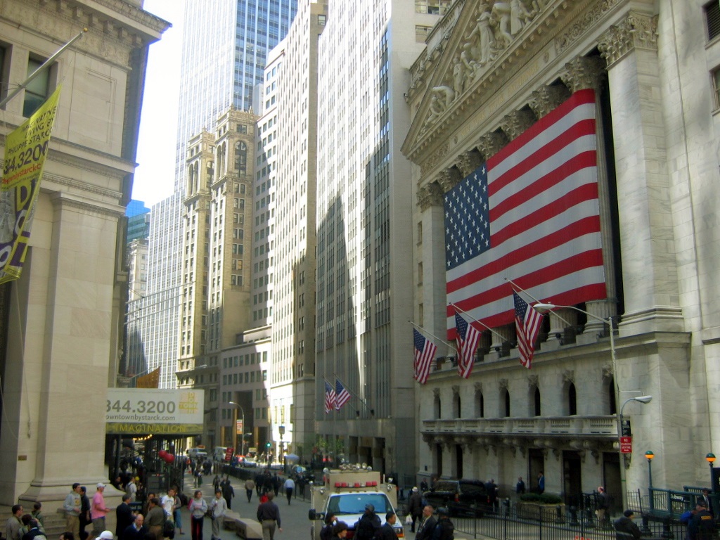
My environment is city based, as a rough guide, I took this image of Wall Street I found on Wikipedia,
Put it into Photoshop and began editing it down into something that looks more dark, foreboding and hostile. I came up with this.
I left a few people in to populate the scene, mostly Police/Law Enforcement, as I felt it was in keeping with the animation idea.
I used the burn tool to draw out the Highlights, Shadows and Mid Tones, then applied a Film Grain filter over the top, to add to the dirty look and rain slick feel, letting lighter areas show on the road for that rain/puddle effect.
Photoshop isn't my program of choice, but I wanted to give it a go here.
More along the lines of environments will be the Compounds that Van Laaq run most of their business through, training agents, building weapons, that kind of thing.
Digital Concepts for tank
Using Photoshop (Not a clue on how to use it, mind), I put together some concepts for the tank.
I started with a grey/black version. From there, I added a new layer and added colour over the top.
An early test was Red, as shown here.
Taking a cue from Portal (Valve), I made a "Jungle King" version. Just a bit of fun ;)
I opted for a green tank, reminiscent of the army. I referred to this as "Starbug" whilst making it, as it reminded me of the Starbug from BBC's Red Dwarf. I added muzzle flares to the gun arm to add a bit of action!
Thursday, 15 November 2012
Cyberpunk clothes.
For my female character's clothes, I am looking to have clothes that would be practical for her role in the team, being heavily Espionage, her outfit must allow her to blend into crowds, so as not to draw attention to herself, or to help in her escape, should her mission go wrong.
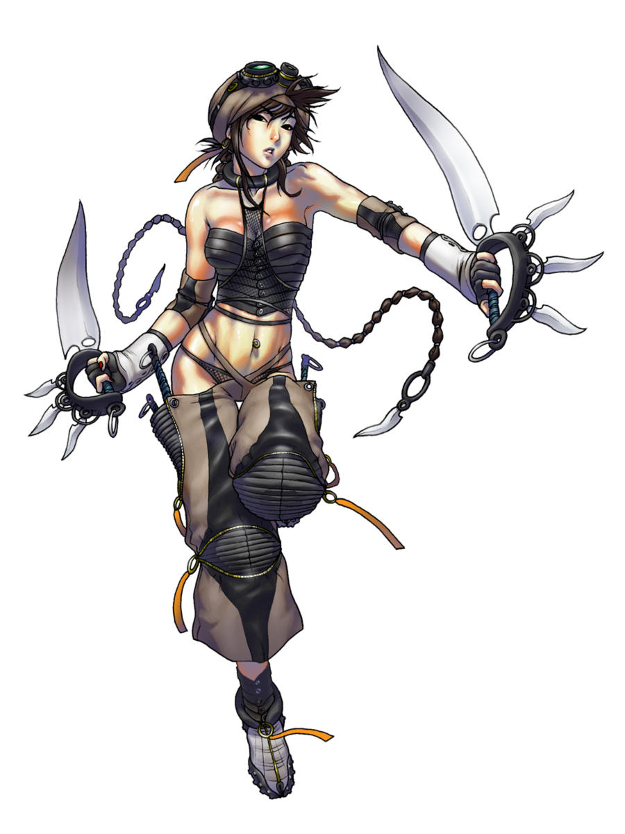
(Deviant Art, http://fc02.deviantart.net/fs4/i/2004/197/8/e/NOMADS_Cyberpunk_2.jpg)
Very ninja in appearance, the loose clothing would allow good maneuverability, but could possibly make her stand out from the crowd, with the ample amounts of flesh showing, (Or perhaps not, what with the stereotypical Geordie women, and the film being set int he North East of England)
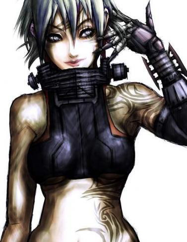
Roleplay Gateway/Deviant Art http://fc01.deviantart.net/fs33/f/2008/309/6/1/vax__2_by_tekkoontan.jpg
With the same drawback as the previous outfit, standing out from the crowd is a big problem, but the cybernetic arm looks good for my asset ideas of interchangeable arms/weapons.
Neurolab http://www.neurolab-inc.com/blog/wp-content/uploads/2010/06/NeurolaB-Inc.-Goggle-CyberPunk-V-2.jpg
Cyberpunk goggles, they look awesome, but with my character not actually wearing any (in my initial design), I thought that maybe the bionic eye, rather than looking like a camera shutter, could look like the lens from the goggles. The dual shuttered look is definitely something I will bear in mind as it almost looks like part of microchips.
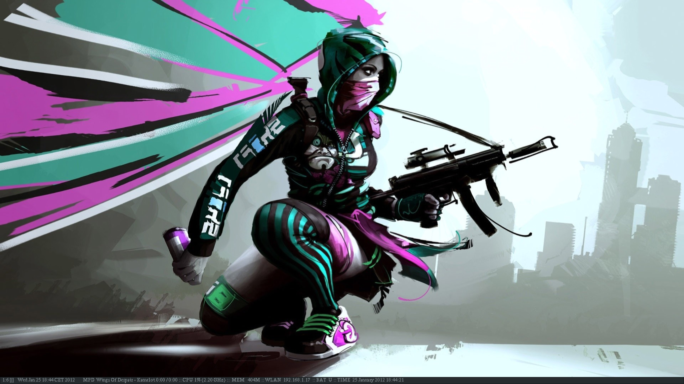
Deviant Art. http://fc06.deviantart.net/fs70/f/2012/025/3/c/scrotwm_cyberpunk_by_genessis-d4nkphq.png
Okay, this is just outstanding. Taking the rebellious "Hoody" look, mixing it with a ninja feel and the hushed tones of the background with the bold colours contrast by the character (I'm totally pretentious,...), makes it look and feel cyberpunk, despite not having any cybernetic/futuristic elements. I like this.
Missing Light (Blog) https://blogger.googleusercontent.com/img/b/R29vZ2xl/AVvXsEgJhzI2w8RI2NC-DVqry2bUWXBIHgHaU0saym7FINXSe8f7QMqlb2gBqGEjkfWzBenazQYKQ3Ks_hkZH5dJMFNlNvdQKSW2J9vgIHQJ30Nzo5srtFNs07xTf3e7c5OqHRzrIBHekIWUU-k/s1600/648_1_woman+web_2+copy.jpg
Possible alt. clothes design. The jacket/hood could work as a nice disguise depending on what area she must work in, think Assassin's Creed blending among scholars. (example below)
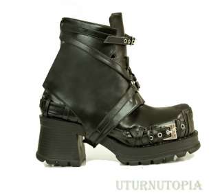
Pop Screen http://img0014.popscreencdn.com/108810473_black-buckle-platform-2-in-1-shoes-goth-cyber-punk-.jpg
Gothic style boots lend perfectly to Cyberpunk. The steel and leather/rubber give well to the hard wearing agent look.
Dirty Lynx https://blogger.googleusercontent.com/img/b/R29vZ2xl/AVvXsEhRDyu1eJr4c2ckIhEwiDIOd1PhPYU64vs7Fe5VKnevoZMyhxR7QFaalAz8nsPFbvxOGeO28o8y3hf9YJRTDx48cKBkiBtUCuYqgYWIGPBewFmrlB7kow0bDO-_cC99z6ConxOIP5FFeIDK/s1600/DL-Sayomi-jacket-box.jpg
Dirty Lynx is a fashion website for the online social network, Second Life. When I saw this, I thought it could make for an interesting alternative to a Combat Vest.
Grizzly Mike http://grizzlymike.com/military/TACTICAL_VEST/CROSSDRAWVEST.GIF
A crossdraw combat vest. The pistol holster is on the front of the vest, rather than on the leg, which is for ease of grabbing and drawing the sidearm.
Mixing this with the Dirty Lynx vest could make for an interesting conversion.
Combat Sport Supply
http://www.combatsportsupply.com/ProductImages/voodoo/207330.jpg
A few different coloured holsters. The bottom right image shows the rear of the holster. The Velcro stripping means that it is meant to be attached to a combat vest via the Molle Webbing
This video from Youtube shows how to attach items to Molle Webbing. It's a system used by the Army, Airsoft and Paintball to name but a few. It allows for customization of vests, to suit the wearer.
(Watch from 00:15)
Life and Liberty gear
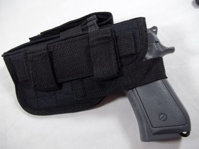
http://www.lifeandlibertygear.com/images/CONDOR-HBerettaAmbidextrousHolsterOD.jpg
This holster has additional webbing to allow more packs to be fitted to it. In the image it has a pocket for handgun magazines
eBay http://img.auctiva.com/imgdata/1/4/6/6/2/3/1/webimg/608982129_tp.jpg
This holster also has straps for magazines.
Burberry http://www.usaburberryscarfsale.com/images/trenchcoat_102.jpg
A female trench coat, by changing the horrible tartan pattern to white or grey, this could be an interesting coat choice for the character.
Grinding http://farm3.static.flickr.com/2617/4039178158_6efdfd8686.jpg
Whilst looking for Cyberpunk Trench Coats, this came up. With the character being grounded in Espionage/hacking, I felt this could make for a good accessory for her.
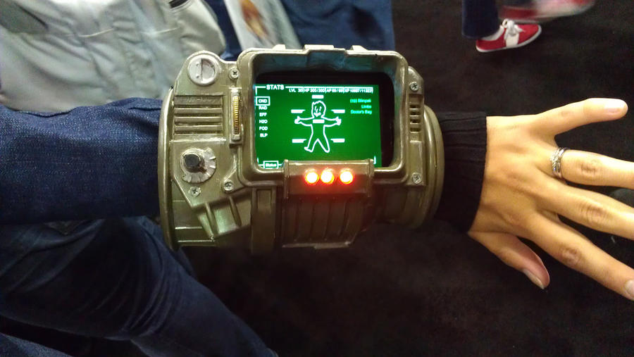
This also has me thinking of the Pip-Boy from the Fallout game series.
Deviant Art http://fc05.deviantart.net/fs71/i/2012/184/3/8/pipboy_3000__anime_expo__l_a__2012_day_2_by_fellowsharcar-d55vz5v.jpg
A real world example of the PipBoy 3000.
Spider Mech, Drone/Tank
A walk cycle for the Spider Mech Drone/Tank. I edited the preset walk cycle to make it appear more robotic and add weight.
The same mech as above. this time using it's front legs as guns. Note the two legs used to balance/stabilize the mech as it fires, much in the same way a JCB (or any other branded heavy lifting vehicle) would.
Thursday, 1 November 2012
Les Machines de l'ile
Friday, 26 October 2012
How rope is made
I'll be using this as reference material for the bionic arm.
http://youtu.be/UyDHBNix6hA
http://youtu.be/UyDHBNix6hA
Thursday, 25 October 2012
Assignment Character
For my assignment, my Cyberpunk setting requires characters. I have designed a female character here, very much the Femme Fatale of Cyberpunk. As of yet, no name is assigned to her. The full body shot gives information about her, her cyborg arm which transforms into a weapon (in her case it will be a sword), her holster with a pistol and two spare magazines, dogtags, as the agents are essentially soldiers, then her Bionic eye. Designed like a camera shutter, it allows the user to relay data to HQ, share camera imagery with the squad and view the "Dataverse", how the cybernetic chip in each agent views the world.
I wasn't happy with her hair. I felt it didn't convey any particular style that matches her outfitting, tight fitting trousers and a tank top. Being a recon/stealth agent, she needs to be free to move, not burdened by a cumbersome uniform. The squad chips emit a beacon which is received by squadmates and relayed through the Bionic eye, reducing the risk of Friendly Fire. The uniforms will be shown on other agents, as they will be a prominent force in view of the public, much like the Police or regular army.
A covert agent, alas, does not want to have logos plastered all over them when infiltrating.
A reworking of the hair/face allowed me to show more detail around her. Her hair is a "punky" style, fairly short and tight, reflecting her outfit. There are cable input points on her temple for hacking security panels.
The bionic eye is more prominent here (left eye, right of picture, duh!).
Her large smile shows that, even though her job involves a lot of risk and death, she totally loves it.
Labels:
Animating,
Animation,
Art,
Assignment,
character,
Chigusa-Kamome,
creature,
design,
Drawing,
Nix
Making a Fantasy Creature
Creating a fantasy creature is trickier than you might think. Combining two or more things to create something that would work is a tough thing.
My first idea for a creature to mix was, as always, A SEAGULL!
The beautiful majesty of the common Laridae was to be mixed with something. To start, it was going to be a lizard, but then, this big 'ol mellon came up with something. Why not take something we see everyday and make it GOOD?
I devised a plan to make... The Homolaridae.
The MANGULL!
I took a stylised female form (a kind of Shōnen manga body shape) and a drawing of a Gull (It was a Herring Gull)
By researching a bird's anatomy from x-rays, I devised a way of creating a creature that could be plausible... In a fucked up kind of way...
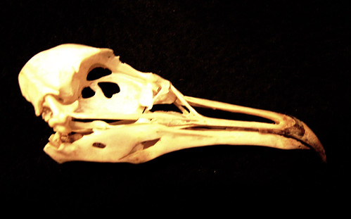
An issue arose, how could wings be attached to a human? They are attached via a kind of shoulder on a bird... So, how about if the shoulder structure of a human skeleton had a version further back, making for two shoulder joints, one for the arm, one for the wing! It's mad, but it may just work! I made sure the muscles around the shoulders would not impede the new bones. It would work! I replaced the human skull with a Seagull skull, having the neck join the skull much in the same way it joins to a human one, meaning the skull had to extend on the back (see top image).
The lower leg is the bone structure of a bird (which is much like ours, until the foot) making the feet that of a bird. The skin reaches down to just above the shin.
The body is feathered from above the breast to the thigh, hiding everyone's shame, allowing their grandmothers to see the image and not blush.
Appeal
Adding appeal to characters is key to evoke emotion from the audience.
These guys are pretty badass, and they are the reason your new fangled tech keeps breaking.
Using a computer Mouse, I created the idea of Scizzy!
He's the anti-hero, an Amiga Mouse (named from the SCSI ports on the Amiga), who has a hatred of new technology that replaces him, like Optical mice, wireless controllers, and mainly graphics tablets.
He's 27 (as the Amiga was first released in 85).
Using his roller ball (or Trackball, what's what mice used to have before funky optics, kids!), he can move fast, however it can stick at the most inappropriate times! (like the real thing)
His cord is broken, now becoming a cigarette, making him look tough.
His companions are the Amiga CD32 controller (C-Dez), a console controller with a superiority complex, as he was way ahead of his time, hence his smug grin.
And, Bug, a Cheetah The Bug joystick, neon green body, red eyes. Really garish to look at, but one hell of a guy! Using his twin port cable (so he can be used on the Spectrum), he can walk, or use them like Nunchucks, making him like a Ninja!
These guys are pretty badass, and they are the reason your new fangled tech keeps breaking.
When are you people going to learn? The older tech is the stuff that will last!
Creating a Parasite.
One task was to create a life cycle of a creature. Using a Parasite, I formed a cycle.
I wanted to ground it in real life as much as possible, so I looked into Parasitic Castration and Cordyceps.
I abandoned the idea of parasitic worms for something more horrible. The fungus (which led me to the Cordyceps). After the parasite infects the host, it (if female) becomes impregnated. I was going to add in Hyperemesis gravidarum, but thought against it, as a mark of respect to people who suffer this illness in real life. I'm all for reality in projects, but for a small task where I have designed something as sinister as what you are about to see, I had to turn it down. It is a very horrible illness. I personally know someone who suffered through this and has had two beautiful, healthy boys.
Now back to the task!
The host dies in labour, leaving a child who is carrying the illness from birth. Females carry the parasitic fungus, whilst males carry the spores, which are secreted in place of Pheromones, spreading the disease through the air. This process results in the end of humanity.
We had to give a factor of, "Eww" if someone was to see it in a film. I thought, "What's worse than a parasite attacking a defenseless child? Well, attacking a defenseless child in utero," which is what is shown above. The Umbilical cord attaches to the fungus, which produces it's own cord into the child, passing on the illness.
All very nasty stuff, and I'm probably going to hell as a result.
Subscribe to:
Comments (Atom)


