Happy Halloween from Chris McEwan Animation
Thursday, 31 October 2013
Monday, 28 October 2013
3D models
Following my presentation, I redid the mug, making it more curved and more like you could drink from it, the first render was too angular. I used the Lathe tool rather than the Boolean for this one. I used edited a box to create the mold bumps where the handle joins the body of the mug, somethign that was missing from the original.
Using the UVW map, I put the file into Photoshop and used my CMANIM graphic. The inside of the mug is a standard colour, matching the glow from the logo.
Friday, 25 October 2013
3D Modelling
3D models I've made for my Interior Design project. I'm making my kitchen and 4 of my assets are as follows:
Coffee/Tea/Sugar pots - Lid made by the Lathe tool, the jar made by the Boolean tool.
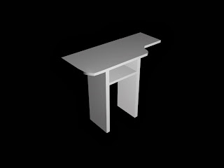
Side Counter, I will look at redoing this using the Loft tool, but this was made through Boxes and Boolean
Mugs, made with the Boolean, the handles are a box with a Bend constraint
Plates, made with the Lathe tool
This is all of the assets combined.
Reference shots.
I should have measured this in cm, but I found a selection for Inches in Max. You can also see the cat eating.
Monday, 21 October 2013
Branding and merchandise
Branding and merchandise is important for any company. It lets people know who you are and what you're about.
www.cafepress.com are a website that can create merchandise with a design of your choice.
http://www.cafepress.co.uk/make/design-your-own
In a website I was involved in with friends when in High School, we set up some merchandise like t-shirts, mugs and mousemats (and for fun, a thong with our friend's face on it).
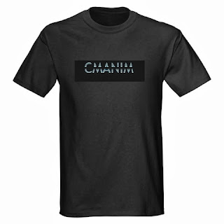
I used Cafepress to mock up a couple items; a flask and a t-shirt
An example of more company merchandise.
www.cafepress.com are a website that can create merchandise with a design of your choice.
http://www.cafepress.co.uk/make/design-your-own
In a website I was involved in with friends when in High School, we set up some merchandise like t-shirts, mugs and mousemats (and for fun, a thong with our friend's face on it).
I used Cafepress to mock up a couple items; a flask and a t-shirt
Sunday, 20 October 2013
Character design
From the start of the project, I had an idea of what I wanted to make, but I felt that the idea could be worked more interestingly than a lizard man. I wanted to keep the claw aspect of what I was thinking of and came up with instead of hands, the demon had blades.
These were the first set of sketches I did of the blades. The rightmost image has the blade and the bone fused together.
I thought that this idea would be impractical because, although the demon doesn't need to eat, how would it open doors and things?
I went to the drawing board and wrote a full backstory to the character and the use of the character (film). The use of scalpels in his life in prison made me think, the blades should be implemented in a similar way. I immediately thought of a Mantis, which gave the character a working title of Man-tis.
I had to think of how the character would activate his blades, but didn't want it to be a standard "Wolverine" style. Then, whilst looking through some comics, I came across my Marvel Zombies book (written by Robert Kirkman), and remembered a panel where... Wolverine... had an accident.
Wolverine's blades burst out of his arm. That is PERFECT for what I need. I reversed how the blades popped out.
They pop from the wrist/hand and give the image of a Mantis. I made the blades larger scalpels instead of samurai swords. The blade is attached into the Carpel bones.
This image shows the blades coming from the character's arms. I wasn't fully decided on the face. He needs to have more electric chair execution equipment.
The demonised face coloured in Photoshop.
Heavily inspired by the Deadites from Evil Dead, but with elements of Tony Scoleri from Ghostbusters 2
A mask worn for electric chair execution, but with a hole cut in for the character to see. His demonic eye is a form of psychological offense, the milky white eye with no pupils is very creepy.
A deathmask/bag is placed on his head, with the electric skullcap. The awkward arms are to show the details of his elongated skeletal/demonic hands and the scarring which the blades burst through. Electric surges through his body and along his blades making him even more lethal.
The first sketch of the character was slightly too human. This was before I opted for the hands and blades rather than just blades.
And the lizardman variant that I was first toying with.
Mood Boarding Characters
To get the visual of a demon/ghost I looked at Tony Scoleri from Ghostbusters 2, one of the ghosts in the courtroom scene. The angular face also made me think of the Deadites from the Evil Dead series. The Deadites are perfect for the Demonic look that I want to convey.
Tony Scoleri's development is something to keep in mind for my character
Tony Scoleri went through three stages of development. The first stage involved using a full-sized puppet with an articulated head. Mark Wilson built the prototype and video tests were promising but Dennis Muren believed the rotoscope load required would hamper the production schedule. Tony was redesigned to be portrayed by Jim Fye. Tony's head was attached to a skullcap positioned in front of and on top of Fye's head. The collarbone was lowered to elongate the neck and add to the emaciated torso design. Oversized shoes, extra lengths of cloth strips, droopy pants, and finger extensions were added to complete the skeletal look.
Tony Scoleri's development is something to keep in mind for my character
Saturday, 12 October 2013
Character Development Mood Board
My Character is a US county jail inmate who was executed in the 1950s by Electric Chair. he would regularly insert blades, scalpels into his wrists and hands and attack other inmates in brutal and often deadly attacks. He wrote down various incantations to summon demons in his own blood, which was then stowed away in his cell, behind a vent.
In 2015, a documentary was to be recorded by a group of students researching the American Judicial system and capital punishment. The prison is long out of official use, and now is used as a tourist location. The students discover the book and read the incantations aloud. The lights begin to flicker and screaming is heard from the execution chamber. They go to investigate the sounds. A spectral image of a man strapped into a floating electric chair, then the lights explode and the screaming stops. The room is scorched and the man is nowhere to be seen.
The inspiration of the floating chair, Ghostbusters 2 - Scoleri Brothers
The group then encounter the man from the chamber. Blades burst from his forearm in a mimic of how he would attack inmates in his lifetime. Electric surges around his blades, taking in electricity from the surrounding area. What ensues is a night of pure terror with the demon picking off the group one-by-one.
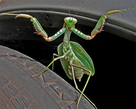
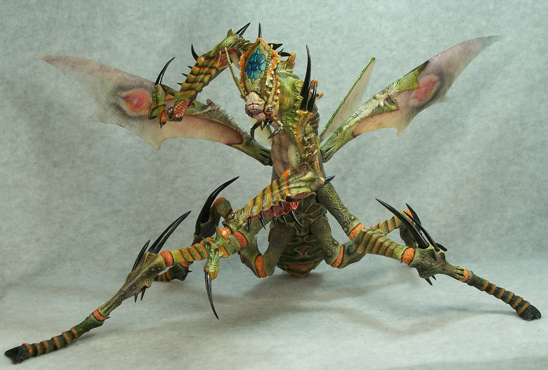
In demon form, with blades extended, I want the character to resemble a sort of Mantis (as depicted on the character's tattoo on his arm). The ends of the arms are how I want the blades to appear, bursting from the forearm.
(Thankfully, this is a painted model, but my god, this is amazing!)
Scyther, from Pokémon
Friday, 11 October 2013
Photoshop 3D elements
Using Photoshop CS6's 3D elements, I created a Tron style 3D text image. The light effects are a mixture of 3D world lighting, Inner glows and Outer glows.
The font was downloaded from www.dafont.com and a texture was used. I Google Searched "Scratched Glass Texture" and found a photograph of scratched glass. It was used as a bump map on the text/bevel.
The font was downloaded from www.dafont.com and a texture was used. I Google Searched "Scratched Glass Texture" and found a photograph of scratched glass. It was used as a bump map on the text/bevel.
Friday, 4 October 2013
A couple pieces to keep in mind for Vis Effects project.
http://www.sidefx.com/index.php?task=view&id=1822&Itemid=68
Scott Pilgrim - Houdini sections (Mr. X and Double Negative used Houdini at various sections)
http://www.mtv.com/news/articles/1645800/scott-pilgrim-inside-creation-six-fights.jhtml
Interview/breakdown with Frazer Churchill, Visual Effects Supervisor on Scott Pilgrim
http://www.fxguide.com/featured/Scott_Pilgrim_and_VFX_Against_the_World/
Gives a breakdown of the effects used in the fight scenes
Subscribe to:
Comments (Atom)


